Front-End SDK Overview
Ec-react (also known as the frontend sdk) allows developers to easily integrate with Socotra Insurance Suite. This SDK is written in TypeScript and React and provides an easy entry point to interacting with the system via components, utilities, and schemas.
These components, schemas and utilities are compatible with any React application including server side frameworks like Next.JS and Gatsby.
Getting Started
This SDK contains three individual packages for building and managing React applications for use in the Socotra Insurance Suite.
@socotra/ec-react-components: A React component library for generating forms and other components for EC.@socotra/ec-react-utils: A set of utility functions for integrating ec-react-components with API responses.@socotra/ec-react-schemas: Zod schemas for validating requests and responses from EC.
In addition to the published packages, Socotra has 2 sample projects available by request.
@socotra/sandbox: Vite / React / TypeScript / Tailwind implementation of the SDK with custom styles applied to the components from @socotra/ec-react-components@socotra/vanilla-sandbox: Vite / React / TypeScript implementation of the SDK with a simple stylesheet applied.
Installation
Add all packages to your existing project
npm i @socotra/ec-react-schemas @socotra/ec-react-utils @socotra/ec-react-components
Schemas
@socotra/ec-react-schemas is a package of zod schemas and TypeScript types for typing requests and responses from Enterprise Core.
Installation
Add all packages to your existing project
npm i @socotra/ec-react-schemas
Example Usage
After installation, import schemas from the root of the package as needed. In the example below, we use the AccountRequest type and accountResponseSchema to validate the data coming in and out of EC while we create a new account.
import {
  AccountRequest,
  accountResponseSchema,
} from '@socotra/ec-react-schemas';

export async function createAccount({
  data,
  tenantLocator,
}: {
  // Ensures the data being sent is correctly shaped for the accounts API
  data: AccountRequest;
  tenantLocator: string;
}) {
  const response = await fetch(`/policy/${tenantLocator}/accounts`, {
    method: 'POST',
    body: JSON.stringify(data),
    headers: {
      'Content-Type': 'application/json',
    },
  });

  // Ensures that response.json() is exactly what is defined by accountResposeSchema
  const account = accountResponseSchema.parse(await response.json());

  // account is now typed as AccountResponse
  return account;
}
List of Schemas
Config
Schemas and types that define the Data Model returned by EC.
Exported Schemas
accountConfigRecordSchemaaccountConfigSchemadataModelSchemadataTypeConfigSchemadataTypesRecordSchemaelementConfigRecordSchemaelementConfigSchemafieldConfigRecordSchemafieldConfigSchemaproductConfigSchemaproductConfigRecordSchemacoverageTermSchemacoverageTermsRecordSchemacoverageTermOptionSchemaquantifiersSchemaoptionalQuantifiersSchemadelinquencyPlanSchemadelinquencyPlanRecordsSchemadelinquencyLevelSchemaadvanceLapseToSchemaautoRenewalPlanSchema
Exported Types
AccountConfigRecordAccountConfigDataModelDataTypeConfigRecordDataTypeConfigElementConfigRecordElementConfigFieldConfigRecordFieldConfigProductConfigRecordProductConfigTenantBaseConfigCoverageTermOptionCoverageTermsConfigRecordCoverageTermsConfigQuantifiersOptionalQuantifiersDelinquencyPlanAutoRenewalPlan
Quote
Schemas and types used to validate and type requests and responses to the Quote API in EC. Also has types and schemas for a quote’s element, exported as well.
Exported Schemas
quoteResponseSchemaquoteStateEnumSchemaquoteDurationBasisEnumSchemaquoteBillingLevelEnumSchemaquoteBillingTriggerEnumSchemaquoteRequestSchemaelementRequestSchemaelementResponseSchemaExported TypesQuoteResponseQuoteStateQuoteDurationBasisQuoteRequestElementRequestElementResponse
Account
Schemas and types used to validate and type requests and responses to the Accounts API in EC.
Exported Schemas
accountResponseSchemaaccountRequestSchemaaccountBillingLevelEnumSchemaaccountStateEnumSchemaExported TypesAccountResponseAccountRequestAccountStateEnumAccountBillingLevelEnum
Policy
Schemas and types used to validate and type requests and responses to the Policy API in EC.
Exported Schemas
policyResponseSchemapolicyDurationBasisEnumSchemapolicyBillingLevelEnumSchemapolicyBillingTriggerEnumSchematransactionCategoryEnumSchematransactionSnapshotResponseSchemadocumentStateEnumSchemadocumentReferenceTypeEnumSchema,documentSummarySchemaelementSummarySchemasubsegmentSummarySchematermSummarySchemapolicySnapshotResponseSchema
Exported Types
PolicyResponsePolicyDurationBasisPolicyBillingLevelPolicyBillingTriggerTransactionSnapshotResponseTransactionCategoryDocumentStateDocumentReferenceDocumentSummaryElementSummarySubsegmentSummaryTermSummaryPolicySnapshotResponse
Components
@socotra/ec-react-components is a package of customizable React components ready for installation.
Typical Installation
Install dependencies
npm i @socotra/ec-react-components
At the root of your react Application, import the style sheet for the components
import '@socotra/ec-react-components/dist/style.css';
Installation With Tailwind and Custom Theme
Install dependencies
npm i @socotra/ec-react-components
Install Tailwind and the container queries plugin
npm install -D tailwindcss @tailwindcss/container-queries
npx tailwindcss init
Add the paths to all of your template files in your tailwind.config.js file.
/** @type {import('tailwindcss').Config} */
module.exports = {
  content: [
    "./src/**/*.{js,jsx,ts,tsx}",
  ],
  theme: {
    extend: {},
  },
  plugins: [],
}
Add
@socotra/ec-react-componentsto your content path array in your tailwind.config.js file
/** @type {import('tailwindcss').Config} */
module.exports = {
  content: [
    "./src/**/*.{js,jsx,ts,tsx}",
    "./node_modules/@socotra/ec-react-components/dist/**/*.js",
  ],
  theme: {
    extend: {},
  },
  plugins: [],
}
Add tailwind container query plugin to your plugins array in your tailwind.config.js file
/** @type {import('tailwindcss').Config} */
module.exports = {
  content: [
    "./src/**/*.{js,jsx,ts,tsx}",
    "./node_modules/@socotra/ec-react-components/dist/**/*.js",
  ],
  theme: {
    extend: {},
  },
  plugins: [require('@tailwindcss/container-queries')],
}
Add the @tailwind directives for each of Tailwind’s layers to your
./src/index.cssfile.
@tailwind base;
@tailwind components;
@tailwind utilities;
Create a theme via a theme builder and click Copy Code
Paste copied code under the tailwind directives of your
./src/index.cssfile
@tailwind base;
@tailwind components;
@tailwind utilities;

@layer base {
  :root {
    --background: 0 0% 100%;
    --foreground: 224 71.4% 4.1%;
    --card: 0 0% 100%;
    --card-foreground: 224 71.4% 4.1%;
    --popover: 0 0% 100%;
    --popover-foreground: 224 71.4% 4.1%;
    --primary: 262.1 83.3% 57.8%;
    --primary-foreground: 210 20% 98%;
    --secondary: 220 14.3% 95.9%;
    --secondary-foreground: 220.9 39.3% 11%;
    --muted: 220 14.3% 95.9%;
    --muted-foreground: 220 8.9% 46.1%;
    --accent: 220 14.3% 95.9%;
    --accent-foreground: 220.9 39.3% 11%;
    --destructive: 0 84.2% 60.2%;
    --destructive-foreground: 210 20% 98%;
    --border: 220 13% 91%;
    --input: 220 13% 91%;
    --ring: 262.1 83.3% 57.8%;
    --radius: 1rem;
    --chart-1: 12 76% 61%;
    --chart-2: 173 58% 39%;
    --chart-3: 197 37% 24%;
    --chart-4: 43 74% 66%;
    --chart-5: 27 87% 67%;
  }

  .dark {
    --background: 224 71.4% 4.1%;
    --foreground: 210 20% 98%;
    --card: 224 71.4% 4.1%;
    --card-foreground: 210 20% 98%;
    --popover: 224 71.4% 4.1%;
    --popover-foreground: 210 20% 98%;
    --primary: 263.4 70% 50.4%;
    --primary-foreground: 210 20% 98%;
    --secondary: 215 27.9% 16.9%;
    --secondary-foreground: 210 20% 98%;
    --muted: 215 27.9% 16.9%;
    --muted-foreground: 217.9 10.6% 64.9%;
    --accent: 215 27.9% 16.9%;
    --accent-foreground: 210 20% 98%;
    --destructive: 0 62.8% 30.6%;
    --destructive-foreground: 210 20% 98%;
    --border: 215 27.9% 16.9%;
    --input: 215 27.9% 16.9%;
    --ring: 263.4 70% 50.4%;
    --chart-1: 220 70% 50%;
    --chart-2: 160 60% 45%;
    --chart-3: 30 80% 55%;
    --chart-4: 280 65% 60%;
    --chart-5: 340 75% 55%;
  }
}
The exported components take into account the various colors from the variables set above and have dark and light mode variants. To adjust the primary color beyond what is available in the theme builder, change the primary HSL code to whatever is required by your application.
Example Usage
After installation, import components from the root of the package as needed.
In the example below, we import various types and schemas from @socotra/ec-react-schemas and then use those to write an interface for a component that uses the QuoteForm.
The result is a fully functional form that makes a request to EC when the submit button is pressed.
import { useState } from 'react';
import { QuoteForm } from '@socotra/ec-react-components';
import {
  DataModel,
  DataTypeConfigRecord,
  QuoteRequest,
  QuoteResponse,
  quoteResponseSchema,
} from '@socotra/ec-react-schemas';

interface Props {
  quote: QuoteResponse;
  dataTypes: DataTypeConfigRecord;
  dataModel: DataModel;
}

export const UpdateQuoteForm = (props: Props) => {
  const [quote, setQuote] = useState<QuoteResponse>(props.quote);

  const handleUpdateQuote = async (updatedQuote: QuoteRequest) => {
    const response = await fetch('/policy/{tenantLocator}/quotes/{locator}', {
      method: 'PATCH',
      headers: {
        'Content-Type': 'application/json',
      },
      body: JSON.stringify(updatedQuote),
    });

    if (!response.ok) {
      throw new Error('Failed to update quote');
    }

    const quote = quoteResponseSchema.parse(await response.json());

    setQuote(quote);
  };

  return (
    <QuoteForm
      quote={quote}
      dataTypes={props.dataTypes}
      dataModel={props.dataModel}
      handleSubmit={handleUpdateQuote}
    />
  );
};
Components
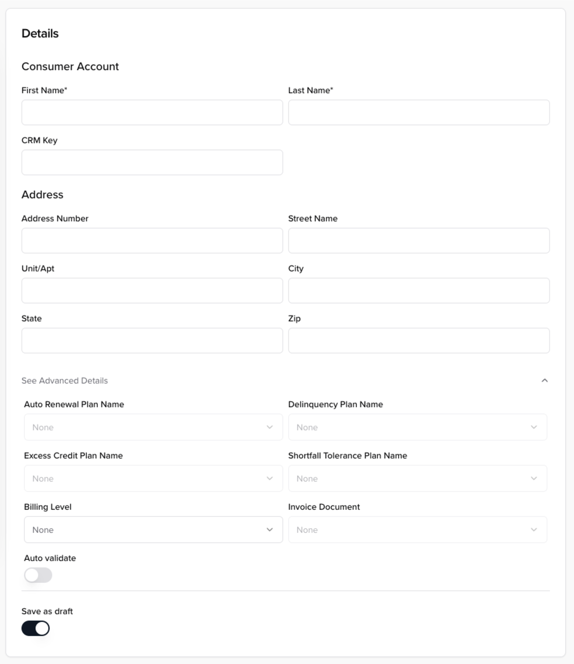
AccountForm
The account form takes a data model, account type, and an account and renders a form that when submitted creates an AccountRequest.
The following props are required:
/**
* The resolved data model for **all** accounts retrieved from the data model
response */
accountsModel: AccountConfigRecord;
/**
* The account type to use for the form, used to pick the correct data model from
the accountsModel */
accountType: keyof AccountConfigRecord;
/**
* The custom data types for the configuration that may be referenced by the
account's data model */
dataTypes: DataTypeConfigRecord;
/**
* The function to call when the form is submitted. It will create an AccountRequest
from the form data. */
handleSubmit: (data: AccountRequest) => void;
The following props are optional:
/**
* The account object to put the form in update mode
*/
account?: AccountResponse;
/**
* Set to true when the form is submitting to set fields to readonly and disable
the submit button */
isSubmitting?: boolean;
/**
* Disables the form
*/
disabled?: boolean;
/**
* Prevents the form from resetting when disabled
* default is true
*/
/**
* Prevents the form from resetting when changing from enabled to disabled
* Default is true
*/
preventFormResetOnDisabled?: boolean;
/**
* Hides the submit button
* Default is false
*/
hideSubmitButton?: boolean;
/**
* Whether to validate the form on submit inline
* Default is false
*/
validateOnSubmit?: boolean;
/**
* The text to display on the submit button
*/
submitButtonText?: string;
/**
* ID for the form wrapper, used to submit the form remotely
* */
id?: string;
/**
* Customizing the advanced fields section of the form
**/
advancedOptions?: {
  /**
  * The auto renewal plans for the account
  */
  autoRenewalPlans?: string[];
  /**
  * The delinquency plans available for the account
  */
  delinquencyPlans?: string[];
  /**
  * The excess credit plans available for the account
  */
  excessCreditPlans?: string[];
  /**
  * The shortfall tolerance plans available for the account
  */
  shortfallTolerancePlans?: string[];
  /**
  * The invoice documents available for the account
  */
  invoiceDocument?: string[];
};
/**
* Customize titles
**/
titles?: {
  seeAdvancedDetails?: string;
};
Renders the following (and dynamically adjusts based on the DataModel):

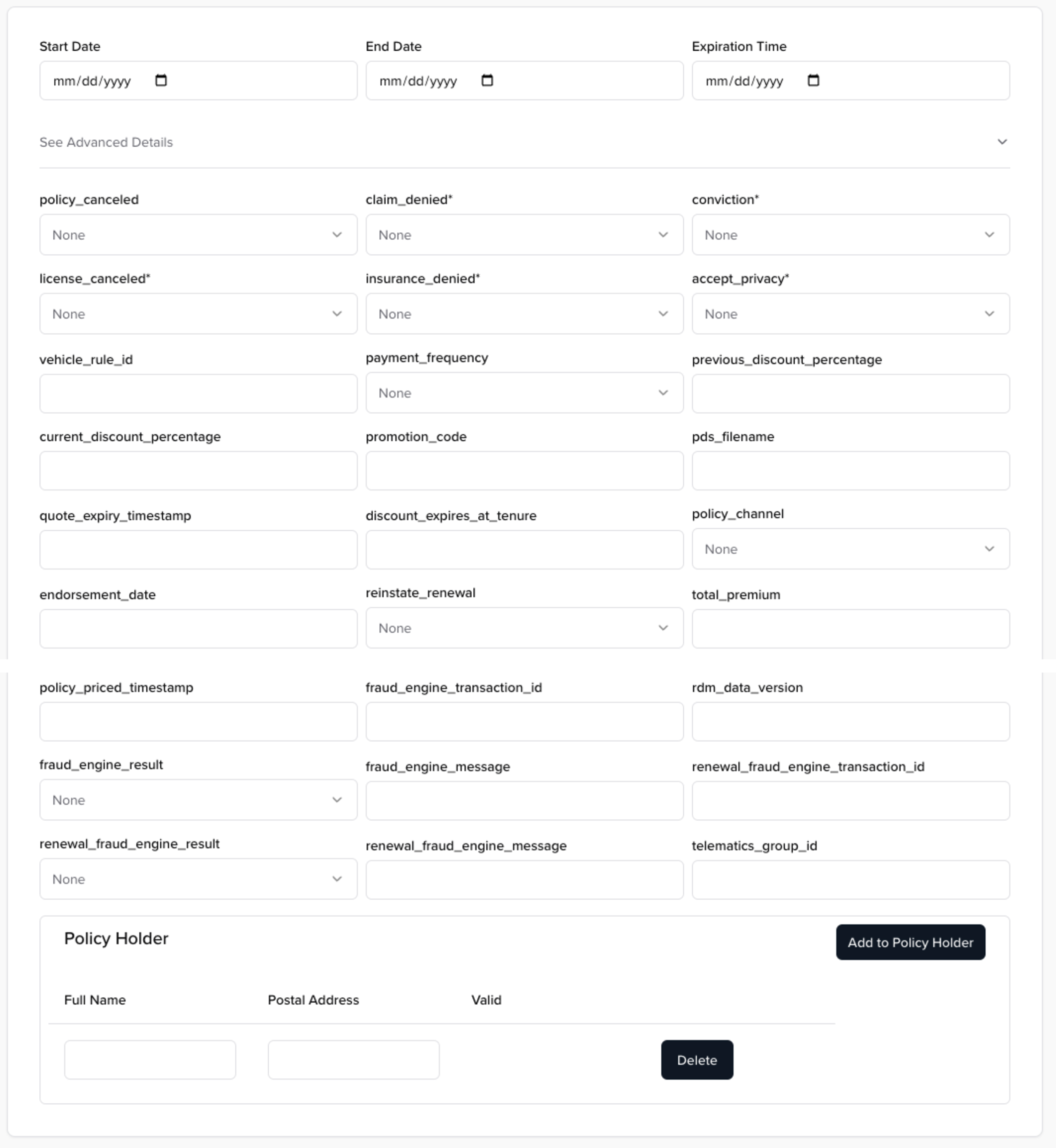
QuoteForm
The quote form takes a quote, data model, and data types response from the data model, along with a handleSubmit function and renders a form for updating quotes.
The following props are required:
/**
* The quote object
*/
quote: QuoteResponse;
/**
* The resolved data model retrieved from data model response
*/
dataModel: DataModel;
/**
* The custom data types for the configuration that may be referenced by the elementModel
*/
dataTypes: DataTypeConfigRecord;
/**
* The function to call when the form is submitted. It will create an QuoteRequest from the form data.
*/
handleSubmit: (data: QuoteRequest) => void;
The following props are optional:
/**
* Set to true when the form is submitting to set fields to readonly and disable the submit button
*/
isSubmitting?: boolean;
/**
* Disables the form
*/
disabled?: boolean;
/**
* Prevents the form from resetting when changing from enabled to disabled
* Default is true
*/
preventFormResetOnDisabled?: boolean;
/**
* Hides the submit button
* Default is false
*/
hideSubmitButton?: boolean;
/**
* Whether to validate the form on submit inline
* Default is false
*/
validateOnSubmit?: boolean;
/**
* The text to display on the submit button
*/
submitButtonText?: string;
/**
* ID for the form wrapper, used to submit the form remotely
* */
id?: string;
/**
* Titles for the form
*/
titles?: {
  details?: string;
  seeAdvancedDetails?: string;
  coverageTerms?: string;
  currency?: string;
  timezone?: string;
  billingLevel?: string;
  billingTrigger?: string;
  durationBasis?: string;
  delinquencyPlanName?: string;
  autoRenewalPlanName?: string;
};
Renders the following (and dynamically adjusts based on the DataModel):

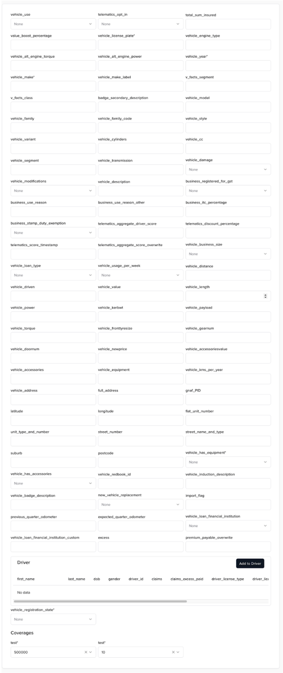
ElementForm
The element form takes an element, an element model, data types, and coverage terms from the DataModel, along with a handleSubmit function, and renders a form that allows for the updating of existing elements.
The following props are required:
/**
* The element object from the quote
*/
element: ElementResponse;
/**
* The resolved data model for the element retrieved from the data model response
*/
elementModel: ElementConfig;
/**
* The custom data types for the configuration that may be referenced by the elementModel
*/
dataTypes: DataTypeConfigRecord;
/**
* The coverage terms configuration that may be referenced by the elementModel
*/
coverageTerms: CoverageTermsConfigRecord;
/**
* The function to call when the form is submitted. It will create an ElementUpdateRequest.
*/
handleSubmit: (data: ElementRequest) => void;
The following props are optional:
/**
* Set to true when the form is submitting to set fields to readonly and disable the submit button
*/
isSubmitting?: boolean;
/**
* Disables the form
*/
disabled?: boolean;
/**
* Prevents the form from resetting when changing from enabled to disabled
* Default is true
*/
preventFormResetOnDisabled?: boolean;
/**
* Hides the submit button
* Default is false
*/
hideSubmitButton?: boolean;
/**
* Whether to validate the form on submit inline
* Default is false
*/
validateOnSubmit?: boolean;
/**
* The text to display on the submit button
*/
submitButtonText?: string;
/**
* ID for the form wrapper, used to submit the form remotely
* */
id?: string;
/**
* Titles for the form
*/
titles?: {
  coverageTerms?: string;
};
Renders the following (and dynamically adjusts based on the DataModel):

NewPaymentForm
The new payment form takes account’s locator, invoice’s locator, invoice’s balance, currency, data model, along with a handleSubmit function, and renders a form that allows for making a payment for an invoice.
The following props are required:
/**
* Account locator
*/
accountLocator: string;
/**
* Invoice locator
*/
invoiceLocator: string;

/**
* The currency of the invoice
*/
currency: CurrencyType;
/**
* The resolved data model retrieved from data model response
*/
dataModel: DataModel;
/**
* The function to call when the form is submitted. It will create an PaymentRequest from the form data.
*/
handleSubmit: (data: PaymentRequest) => void;
/**
* Invoice balance
*/
invoiceBalance: number;
The following props are optional:
/**
* Set to true when the form is submitting to set fields to readonly and disable the submit button
*/
isSubmitting?: boolean;
/**
* Disables the form
*/
disabled?: boolean;
/**
* Hides the submit button
*/
hideSubmitButton?: boolean;
/**
* Whether to validate the form on submit
*/
validateOnSubmit?: boolean;
/**
* The text to display on the submit button
*/
submitButtonText?: string;
/**
* ID for the form wrapper
* */
id?: string;

/**
* Titles
*/
titles?: {
  formTitle?: string;
} & Partial<GetPaymentFormDefaultFieldsProps['titles']>;
Renders the following (and dynamically adjusts based on the DataModel):
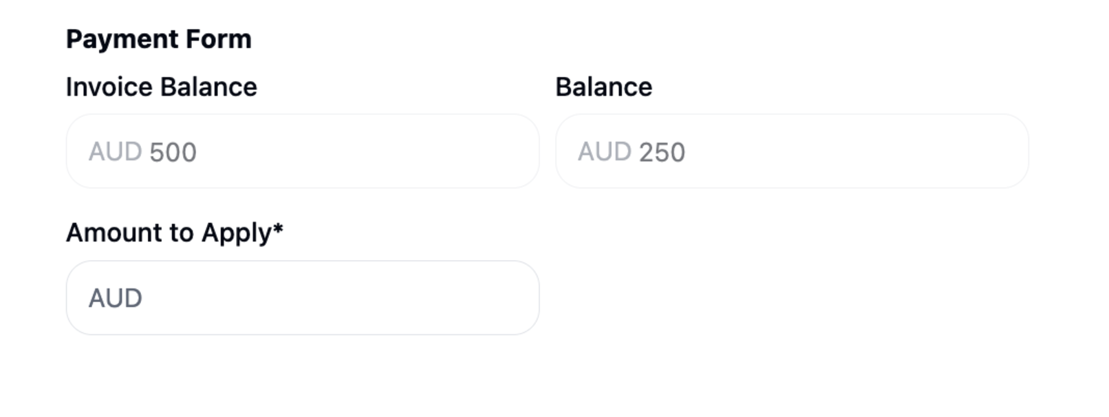
ExistingPaymentForm
The existing payment form takes account’s locator, account’s balance, invoice’s locator, invoice’s balance, currency, along with a handleSubmit function, and renders a form that allows for applying existing account’s balance to an invoice.
The following props are required:
/**
* Account locator
*/
accountLocator: string;
/**
* Invoice locator
*/
invoiceLocator: string;

/**
* The currency of the invoice
*/
currency: CurrencyType;

/**
* Account balance
*/
balance: number;

/**
* The function to call when the form is submitted. It will create an CreditDistributionRequest from the form data.
*/
handleSubmit: (data: CreditDistributionRequest) => void;

/**
* Invoice balance
*/
invoiceBalance: number;
The following props are optional:
/**
* Set to true when the form is submitting to set fields to readonly and disable the submit button
*/
isSubmitting?: boolean;
/**
* Disables the form
*/
disabled?: boolean;
/**
* Hides the submit button
*/
hideSubmitButton?: boolean;
/**
* Whether to validate the form on submit
*/
validateOnSubmit?: boolean;
/**
* The text to display on the submit button
*/
submitButtonText?: string;
/**
* ID for the form wrapper
* */
id?: string;

/**
* Titles
*/
titles?: {
  formTitle?: string;
  balance?: string;
  amountToApply?: string;
  invoiceBalance?: string;
};
Renders the following:

Utils
@socotra/ec-react-utils is a package of utility functions that assist in the development of apps for EC.
Installation
npm i @socotra/ec-react-utils
Example Usage
After installation, import components from the root of the package as needed.
In the example below, we use extractElementDataModel and extractElementFromQuote to grab the pieces we need to pass to ElementForm
// Server Component
import { ElementCard } from '@/components/element-card';
import {
  extractElementDataModel,
  extractElementFromQuote,
} from '@socotra/ec-react-utils';
import {
  getDataModel,
  getQuote,
} from '@/app/actions/quote-actions';

interface Props {
  params: {
    lang: Locale;
    tenantLocator: string;
    quoteLocator: string;
    elementLocator: string;
    elementType: string;
  };
}

export default async function Page(props: Props) {
  const { lang, tenantLocator, quoteLocator, elementLocator } = props.params;
  const quote = await getQuote(tenantLocator, quoteLocator, lang);
  const dataModel = await getDataModel(tenantLocator);

  const elementDataModel = extractElementDataModel({
    dataModel,
    quote,
    elementLocator,
  });

  const element = extractElementFromQuote(quote, elementLocator);

  return (
    <div className='flex flex-col'>
      <ElementCard
        element={element}
        elementModel={elementDataModel}
        dataTypes={dataModel.dataTypes}
        coverageTerms={dataModel.coverageTerms}
      />
    </div>
  );
}

// Client Component
'use client';
import { useTransition } from 'react';
import { ElementForm } from '@socotra/ec-react-components';
import {
  CoverageTermsConfigRecord,
  DataTypeConfigRecord,
  ElementConfig,
  ElementRequest,
  ElementResponse,
} from '@socotra/ec-react-schemas';


interface ElementCardProps {
  element: ElementResponse;
  dataTypes: DataTypeConfigRecord;
  coverageTerms: CoverageTermsConfigRecord;
  elementModel: ElementConfig;
}

export const ElementCard = ({
  element,
  dataTypes,
  coverageTerms,
  elementModel,
}: ElementCardProps) => {
  const [isSubmitting, startTransition] = useTransition();
  const handleSubmit = async (element: ElementRequest) => {
    ...
  }

  return (
    <ElementForm
      elementModel={elementModel}
      coverageTerms={coverageTerms}
      dataTypes={dataTypes}
      element={element}
      handleSubmit={handleSubmit}
      disabled={isSubmitting}
    />
  );
};
List of Utils
Exported Functions
dataModelToJSONSchema
Transforms a DataModel to a valid JSON Schema 7 response
splitInputAndQuantifier
Takes an input name from the config and splits off the quantifier..
E.g., “drivers?” becomes { name: “drivers”, quantifier: “?” }
getQuoteRequest
Used by the QuoteForm internally to transform the form values into a QuoteRequest
getDefaultQuoteValues
Used by the QuoteForm internally to set default values for the form from a QuoteResponse, ProductConfig, and DataModel
getDefaultElementValues
Used by the ElementForm internally to set default values for the form from an ElementResponse
extractElementDataModel
Takes a QuoteResponse, element locator, and DataModel and returns the ElementConfig
extractElementFromQuote
Takes a QuoteResponse and element locator and returns the ElementResponse
extractProductDataModel
Takes a DataModel and productName and returns the found ProductConfig
extractProductElements
Takes a DataModel and ProductConfig and returns a ProductElementMap (shown below)
export interface ProductElementMap {
  coverages: ProductElement;
  exposures: ProductElement;
  policyLines: ProductElement;
  exposureGroups: ProductElement;
}